PUMA KING Showtime: Impossible To Ignore
While most World Cup boots are fighting for attention through louder colours and more aggressive designs, the new PUMA KING Showtime takes a different route. Familiar, unmistakably KING, yet packed with details that make it one of the most interesting releases of the current World Cup cycle.
There are football boots that immediately grab your attention because they are completely different from everything else on the market. Then there are football boots that manage to stand out while remaining true to their own identity. The new PUMA KING Showtime firmly belongs to the second category.
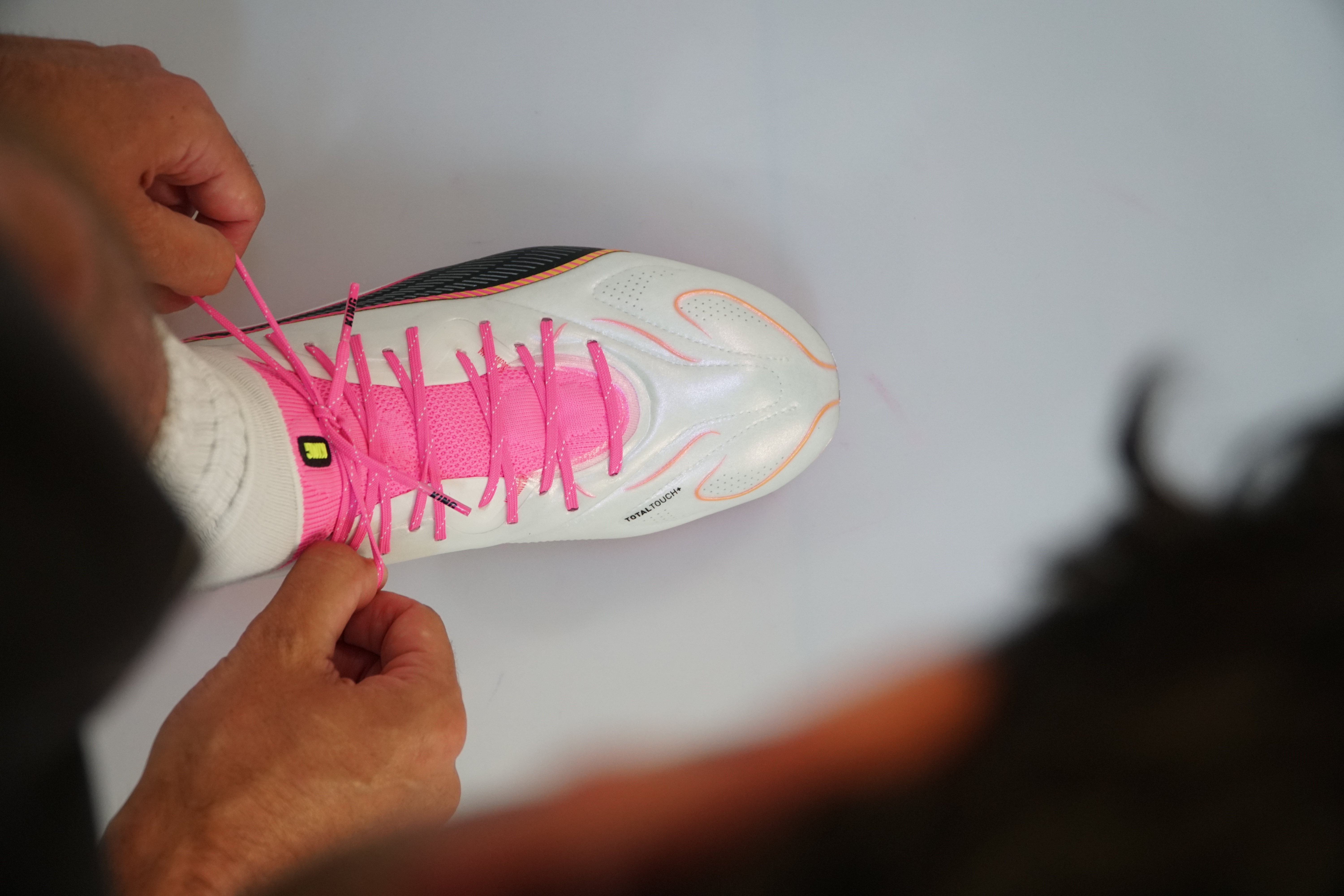
At first glance, the colour palette does most of the talking. Bright pink dominates the upper, combined with white, black and vibrant accent colours that instantly separate the boot from the increasingly crowded World Cup landscape. Yet what makes this release genuinely interesting is not the colour itself, but the way PUMA has approached the details.


The left and right boot do not simply mirror one another. Each carries its own identity through subtle graphic elements, colour placements and soleplate treatments that create an asymmetrical effect rarely seen on a modern KING. It is a design choice that immediately brings back memories of the legendary PUMA Tricks era, one of the most recognisable concepts ever introduced by the brand. Unlike those releases, however, the execution here feels more refined, cleaner and more mature, using contrast and asymmetry without overwhelming the boot's traditional character.
That balance is precisely what makes the KING such an important silo within today's football boot market. While many heritage models have gradually shifted towards more aggressive or experimental directions, the KING has largely maintained the qualities that made players fall in love with it in the first place. Comfort remains central to the experience, the shape stays reassuringly familiar and the overall feeling continues to prioritise connection with the ball over unnecessary complexity.
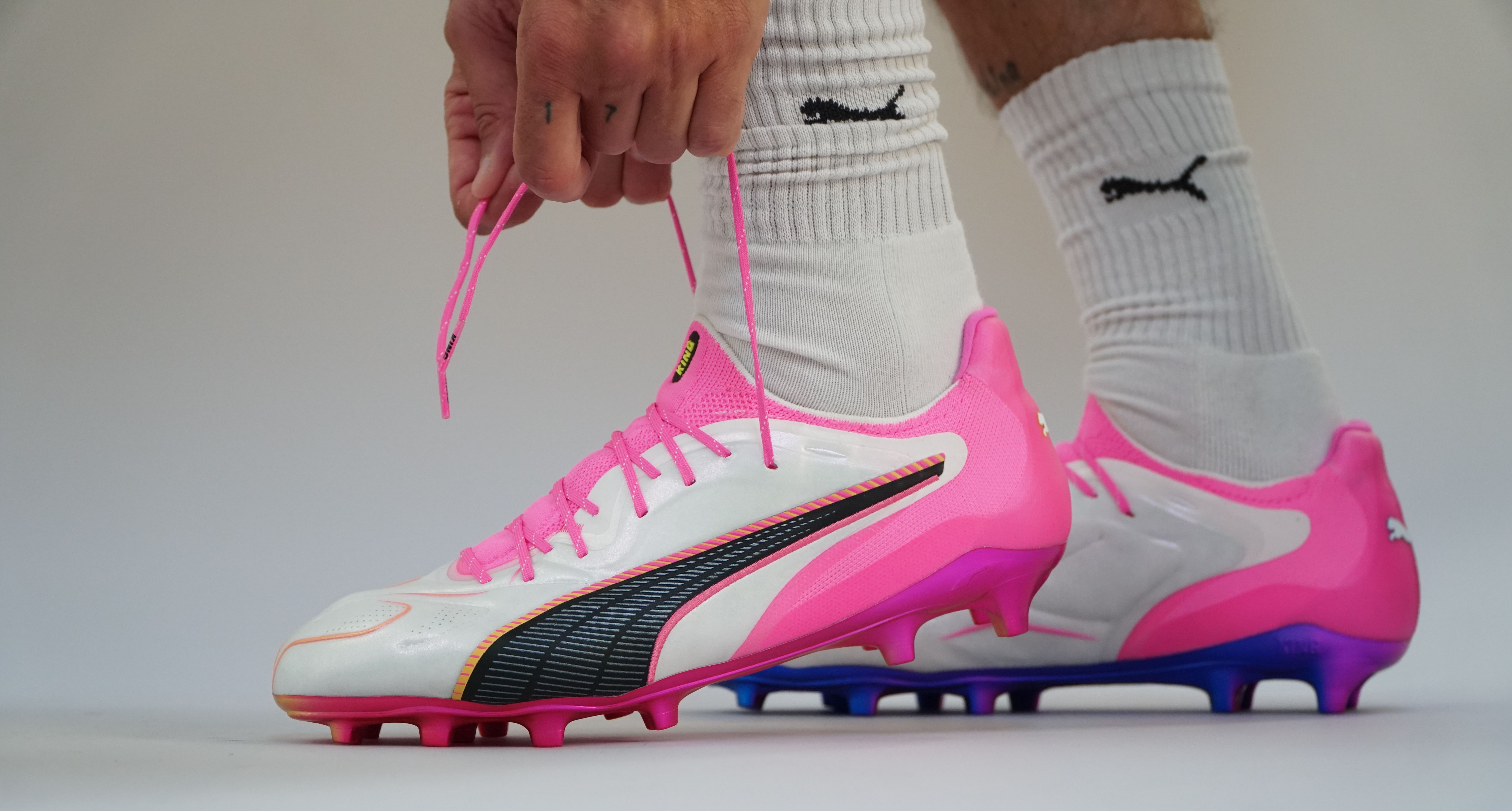
What makes the Showtime edition particularly successful is that it embraces modern football culture without sacrificing those foundations. The silhouette remains elegant and recognisable from every angle, but the contrasting colours, mismatched details and energetic visual language give it a completely different presence compared to traditional KING releases. It feels like a World Cup boot should: bold, memorable and impossible to mistake for anything else.
On foot, those details arguably become even more effective. The different soleplates, the graphic transitions and the vibrant pink upper create a visual impact that photographs cannot fully capture. It is the kind of release that immediately attracts attention during training sessions, matches and product showcases, which is exactly what brands hope to achieve during a World Cup year.
Not everyone will choose it as their favourite boot of the tournament cycle. Personal taste will always play a role, particularly with a colourway this confident. But whether you love it or hate it, one thing becomes clear almost immediately after seeing it in person: ignoring it is simply not an option.